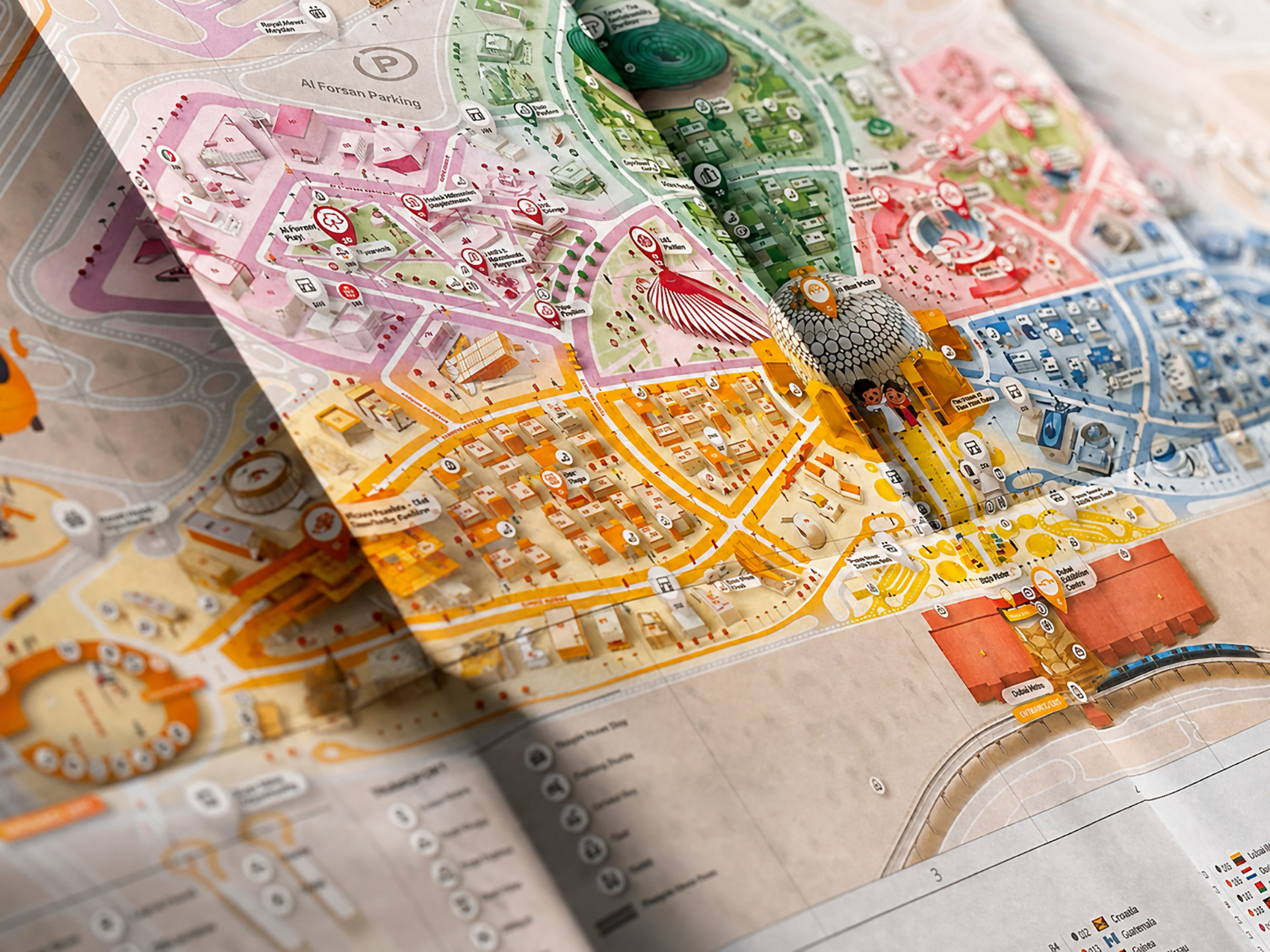
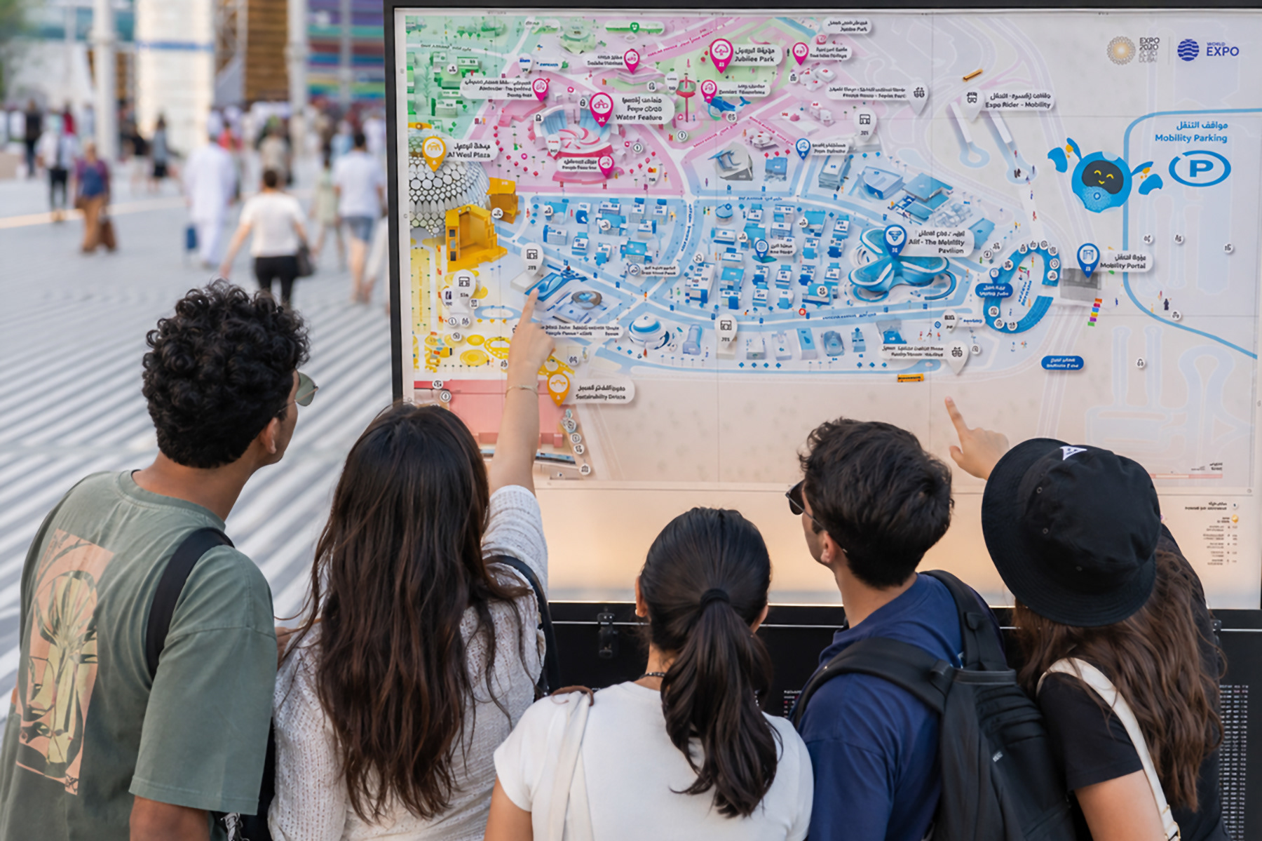
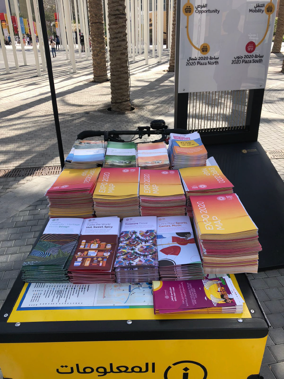
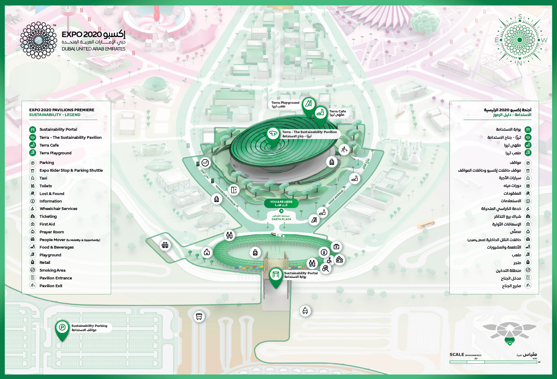
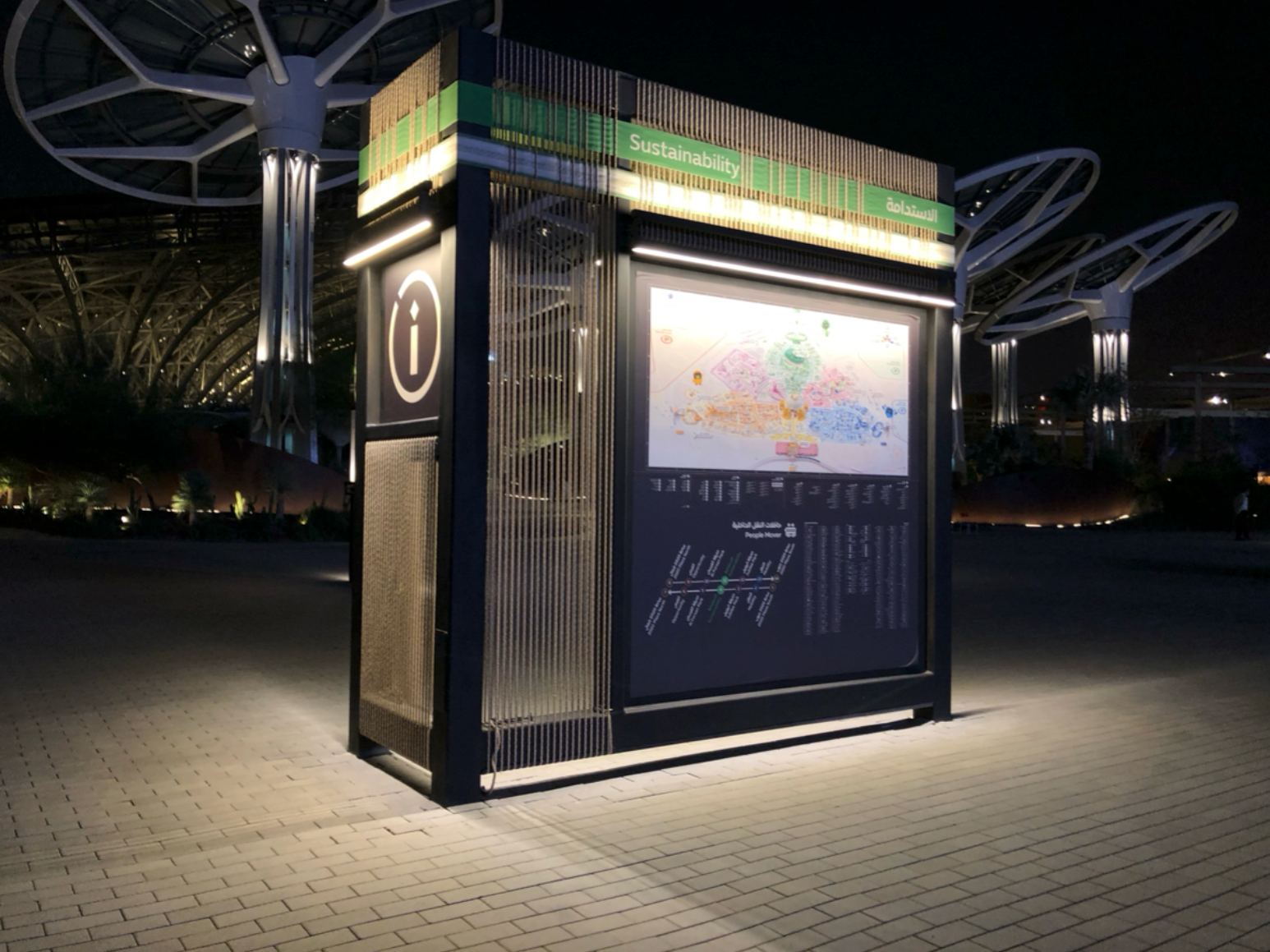
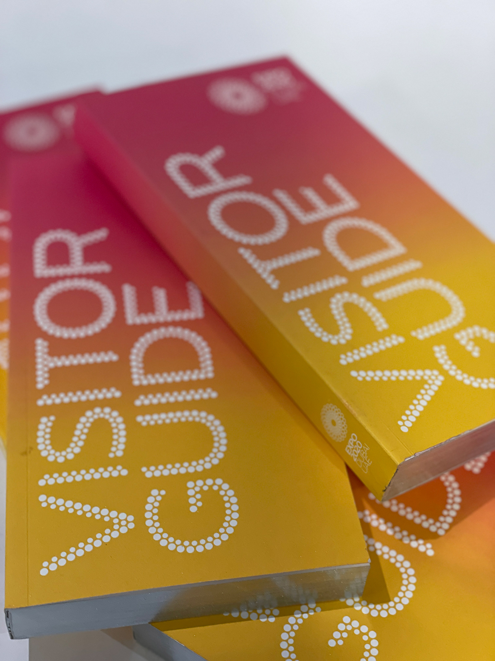
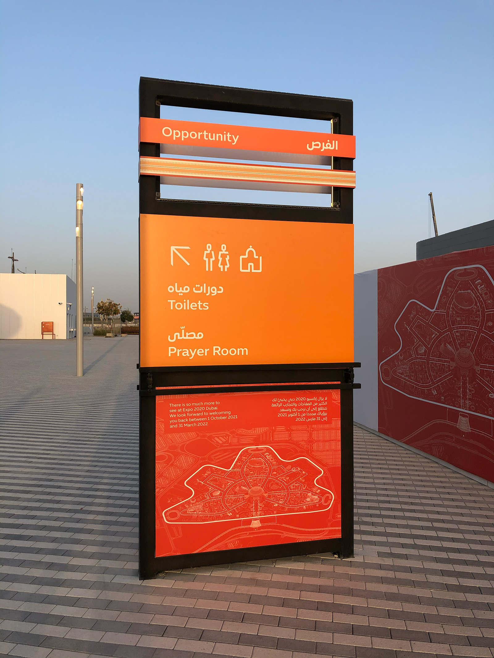

A map can take many shapes and styles, we carefully considered what our audience wanted from an Expo map which in past Expo’s have been illustrative, three-dimensional and engaging. We wanted to create a map that was graphically appropriate to this kind of event, interesting, fun, functional and collectable – the map could become limited edition posters. From a graphical perspective we went with an isometric design approach with a strong use of colour to present the districts and parks. Expo pictograms, street naming, landscaping, installations, fixtures were carefully considered and debated so as not to overwhelm the map with excessive detail. Functionally the map included a grid reference, numerical and alphabetical references in both Arabic and English versions. It also included all the country flags of the participating country pavilions. The map was used on printed wayfinding signage throughout the site, it was used and adapted for digital and printed as a handheld map that visitors could carry as a constant piece of navigation. The foldable map, A2 size, printed two-sides, handheld map was available on-site and externally at hotels, tourist information, airports, cruise ships so it required additional information. Included within its pages: general information – ticketing and contact details, COVID safety, preparing the visit, getting to Expo, getting around Expo, retail items we wanted to promote, Expo app download information and partner visibility.